

Sisu VR
Designing engaging features for an innovative VR startup
Problem Sisu VR needed to prepare its online portal for users.
|
|
Background
Sisu VR is an innovative startup that sells an anti-harassment workplace training program in virtual reality. In Sisu VR's online portal, employees can download training modules and view their progress. Managers can edit their employees' registration, remind employees to complete their training, and track employees' progress on the modules. I was tasked with designing features in the portal. My main goals were to:
|
|
1) Alert System
There needed to be a way for managers to send out email notifications to their employees as a reminder to complete their training modules on time. When discussing this with the infrastructure team, we wanted there to be an option to send notifications:
I wanted to make this process straightforward and intuitive. I created three preliminary designs of the alert system. I included this in a new page called "Send Notifications" under "Registration." In each design, I had a table of employees' information, training status, and alert details, along with "pen and paper" and trashcan icons to the right so the administrator could edit and delete individual alerts. There was also an option to select multiple employees and send alerts to those who were selected. The drop-down menu was not present. |
Preliminary Designs for Alert System
|
|
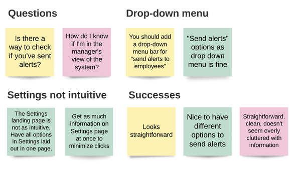
Affinity Map from Usability Testing for Preliminary Design
|
After interviewing several users, I learned that the administrator would likely not have the time or necessity to select individual employees from the table and send alerts to them. I modified the design so that the administrator would first select the type of alert they want to send (on demand, countdown, or scheduled), confirm that they want to send the alert, and only employees who have not completed their training would receive the alert in their email.
One of the problems I had to address was figuring out where to locate the alert system. Drawing from user feedback, I decided to put it under "Manage Alerts" in the Settings page. Users liked the idea of having the alert system in the same place where they could change their password and manage other information in their account. Next, I had to figure out how to display the three options for sending alerts. I included them in a drop-down menu for the user to choose from. Once the user selects an option, it is displayed below the drop-down menu. In addition, almost all users I interviewed wanted to see a log of past alerts that had already been sent. I created a table with this information along with the completion status of employees' training, and placed it below the alert system. I wanted to make it easy for the user to send alerts while referring to this information on the same page so they can quickly decide what kind of alerts they want to send. UI Design |
Final Design |
|
2) Post-program Survey
We also wanted to obtain feedback from employees and supervisors regarding the quality of the training modules. I proposed that we require users to fill out a short survey before viewing their certificate of completion. Before starting work on my design of this feature, I developed two sets of survey questions: one for employees, and the other for supervisors. I included a variety of questions and answer options (checkboxes, multiple choice, free response) and aimed to cover as many aspects of the experience as possible in ten questions or fewer. Slide 1: Clicking on "Print Certificate" on the Home page directs the user to the beginning of the survey. Slide 2: The user is required to give a rating, out of five stars, for their overall experience with the Empower Now Program (ENP) training modules. Slide 3: Once they give a rating, the user has an opportunity to provide more information about their rating in the text box below; this explanation is optional. Slide 4: Clicking "Continue" directs the user to more survey questions. The questions on this page are optional. Slide 5: After completing as much of the survey as they wish, the user is directed to a page where they can download their certificate of completion. UI Design |
Final Design
|
|
Retrospective: What I Learned
|
This was my first experience designing features from start to finish. In all honesty, it was a bit intimidating at first!
To make the process less complex, I started with making clear what I wanted the user to accomplish through each of the features. For the alert system, it was having a place in the portal to send out different types of notifications. For the survey, it was giving users a chance to share their feedback and honest thoughts about the ENP. Next, I broke down each feature into more manageable steps. I made simple sketches of the features and turned them into wireframes in Figma using the portal's existing designs. I then refined them further, down to the smaller details such as font, text size, and colors, so they fit the style guide and the rest of the portal. This was the most time-consuming part of the project, as I wanted to ensure the design looked as clean and polished as possible. Finally, I added some interactions into the designs and turned them into a clickable prototype! During interviews with potential users, I had them walk me through their first impressions and thoughts of the feature, as well as how they would interact with the design. I also paid attention to areas of improvement and what worked well. Overall, I was satisfied with the designs I created for both of these features. If I had more time, I would have conducted more user interviews to get a wider range of opinions and feedback. Interviewing users was the stage of the project I looked forward to the most; it was fun to speak with potential users who could be interacting with Sisu VR's product and portal in the future. Furthermore, knowing that I was designing these features for real people was what kept me motivated through the times I felt frustrated. The most important thing I learned from this experience is the value of user interviews and usability testing. Taking time to interview and truly listen to what users have to say is invaluable; they exposed blind spots I didn't even know I had. |
Acknowledgements
|
I would like to thank Jocelyn Tan, Mindy Nguyen, the Website/Infrastructure Team at Sisu VR, and Santa Clara University's REAL Program for supporting my work on this project.
|
© 2022 Jia Seow
